Ready
-
Brand identity
-
ReadyToPay.com fintech app in the hospitality space
-
Chrysalis.co
Ready is contactless restaurant & hospitality tech that gives guests more choice and businesses more revenue.
While holding the position of Creative Director at Ready, I was instrumental in setting up brand elements and guidelines to ensure a distinct and consistent aesthetic for the product. This effort encompassed all communication channels and the product interface and physical components, establishing a cohesive visual identity.
Logo
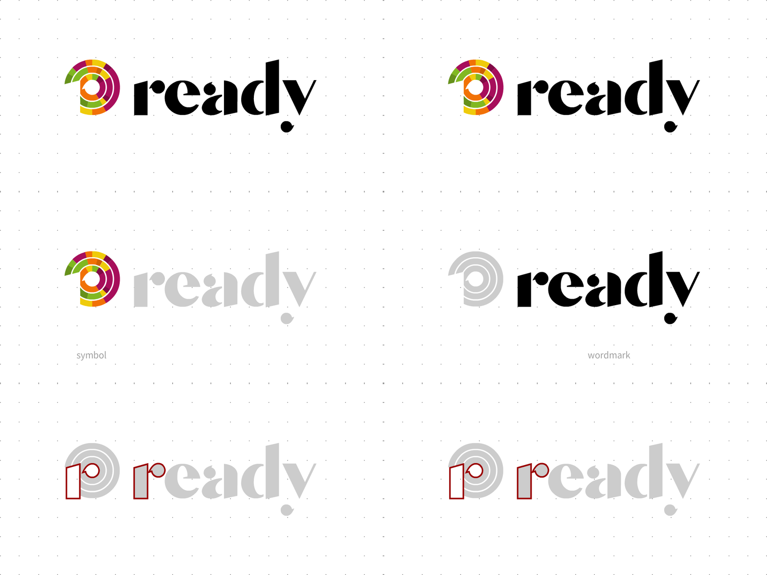
At the heart of Ready's branding lies the Ready logo, effectively conveying the brand's core values of simplicity, resilience, and humble confidence.
The logo comprises two essential elements:
Symbol: The symbol embodies a sense of simplicity yet exudes bold structure. Rooted in the brand's philosophy of the "Subtle Art of Subtraction," it prominently features an "invisible letter r" within "circles of experience," serving as a potent visual anchor.
Wordmark: The wordmark, crafted with a custom "non-serif serif" typeface, combines the essence of reliability stemming from tradition with the sleek minimalism of the modern age.
These elements, the symbol and wordmark, harmoniously represent the yin and yang of Ready's iconography, encapsulating the brand's identity in a balanced and meaningful manner.
Colours
The Ready brand embraces a captivating blend of invigorating, unique, and surprising colors.
Drawing inspiration from the vibrant hues of nourishing foods and lively hospitality encounters, this palette is carefully curated. It's important to note that this array of colors isn't intended for simultaneous use within a single layout. Typically, layouts will predominantly feature the primary color, occasionally complemented by one of the secondary colors to maintain a harmonious and visually engaging presentation.
Typography
To consistently emphasize the prominence of the Ready logo in all collateral, the brand employs a pair of complementary sans-serif typefaces.
Museo Sans 900 (Headers): This font is utilized for headers, ensuring strong legibility and serving as an anchor for the copy.
Source Sans Pro (Subheads, Body, Captions): Employed for subheads, body text, and captions, Source Sans Pro offers a clean and readable typeface that is versatile and effective across both print and digital mediums.
Moreover, Source Sans Pro finds application within our software, unless a specific typeface is chosen by a restaurant brand for the guest-facing app experience. This approach maintains consistency and ensures a cohesive typographic identity throughout Ready's brand collateral.
Motion and Sounds
The Ready animation maintains a consistent style across various applications, encompassing branding, UI elements, and educational materials.
This style is characterized by its simplicity, cleanliness, minimalism, and singular focus, ensuring that each animation distinctly emphasizes one element at any given point.
An exclusive audio signature was developed for the Ready brand to complement both brand animations and positive outcomes during events within the application. This distinctive audio element adds a unique auditory dimension to the brand and enhances the user experience during significant interactions within the application.


