
“Untangling the stories.”
Tangletown
-
Brand Identity
-
Tagletown Pictures, Film Production Co
-
ap2 studio
Tangletown is a motion picture and TV production company that produces character-driven entertainment–with a point of view.
The brand is deceptively simple, encompassing comedy and drama, TV and movies. It’s slightly old-fashioned hinting at the Golden Age of Cinema with its focus on characters and story, rather than a spectacle of superheros content. The name of the company, inspired by a friendly Seattle neighbourhood with maze like streets and alleys, invites readers to untangle storylines and character relationships eventually revealing often surprising narrative finale.
Brand visuals follow the same sentiment, playing with the idea of entanglement in various ways, in reading order, in orientation of the elements or the applied colours. Colour scheme itself mimics the look and feel of the neighbourhood houses, playing well for both serious dramas as well as light hearted sitcoms.
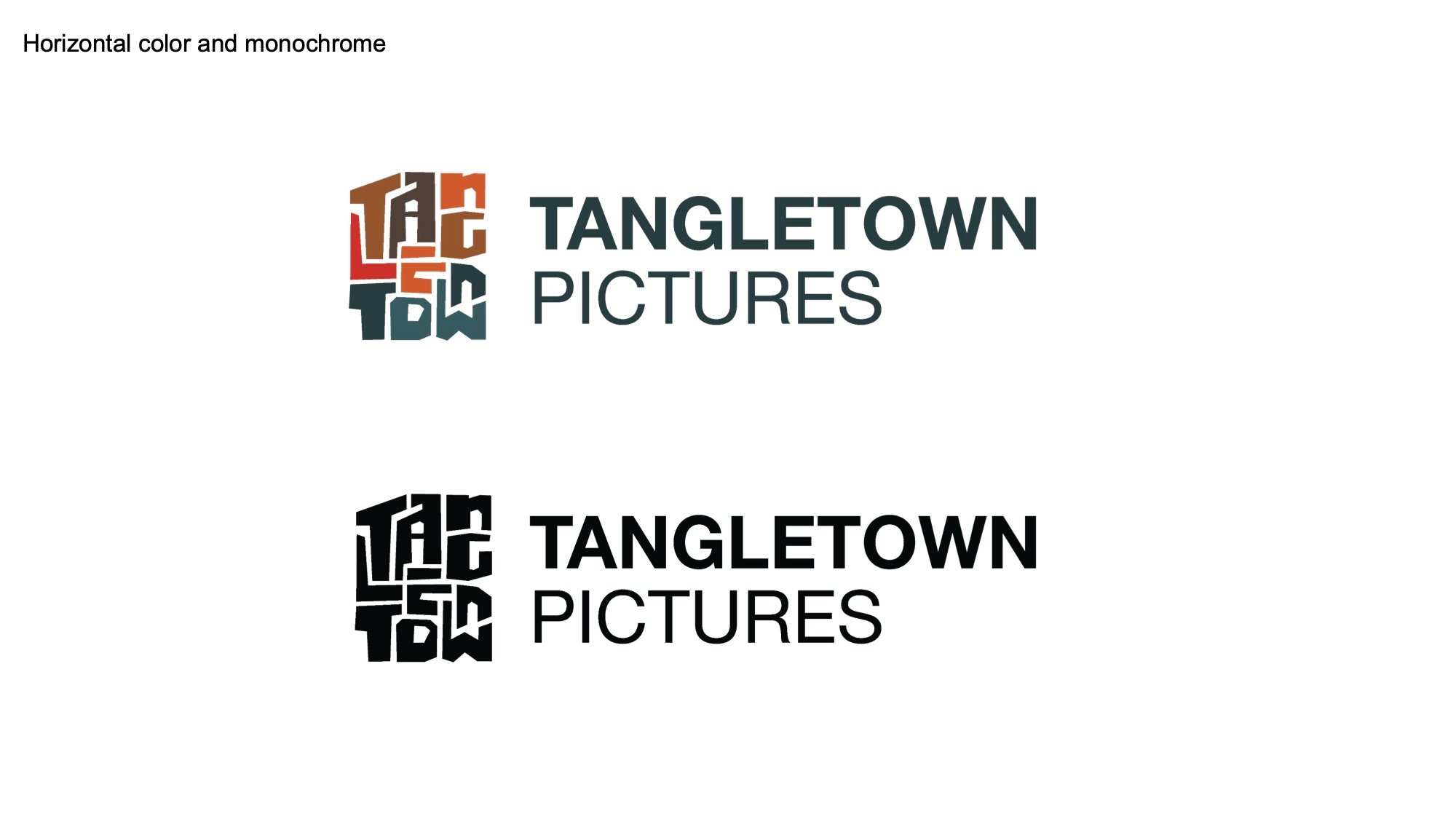
Logo
Tangletown logo is inspired by the shape and navigation of the Seattle’s Tangletown neighborhood with characteristic slanted northwest corner facing Green Lake. It’s delivered in a cutout lettering style reminiscent of a master designer Saul Bass’ movie titles for the movies of Hitchcock, Preminger, or Kubrick. The order of letters is tangled up just about enough to carry that sentiment, but still legible to read the name. The lettering creates a cohesive canvas where the negative space can be interpreted as streets and houses from whichever direction the logo is looked at.
The symbol is juxtaposed against the simple wordmark in Helvetica type.
From Tangletown
Branding Guidelines